Week One Complete!
I’ve now officially spent a week in Paris! I’m baffled at how many things we’ve seen already and how many we’ve yet to see, and I want to take in every bit of it I can (at least to a reasonable extent, there’s only so much walking I can handle).
Design That Speaks
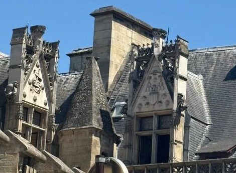
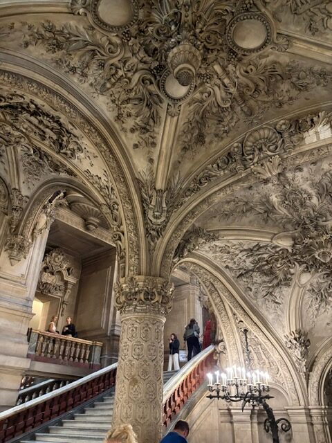
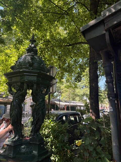
Throughout the week Professor Smith has pointed out different examples of “architecture that speaks”. For example, an old medical school had snakes carved in the detailing as a reference to the Rod of Asclepius and the Greek god of medicine, which would have helped people locate a medical building in a similar way to how we look for a red cross (or green in Paris) when looking for medical help. The Wallace fountains also use details like fish and shells to show a connection to water and their purposes as drinking fountains in the same way some water fountains or water bottle refilling stations will have a water drop to show their purpose. It’s also been fun to search for examples of this on my own, like all of the references to Louis XIV and the monarchy at Versailles and the references to dance and music hidden in the myriad of details in the Opera Garnier. The scalloped shells on the medieval section of the Musee de Cluny might just be my favorite example of this that Professor Smith talked about. In a country with a population that was mostly illiterate, how would you say what a building was, particularly for those not from the city? The scallop shell is a symbol of the Camino de Santiago, the pilgrimage leading to the tomb of St. James and certain places along the route would have a configuration of scallop shells in the stonework, indicating pilgrims could stop there. While pilgrims may not have been familiar with the area or have known how to read, the shells required no translation and they would know it was a place they could turn to along their journey.
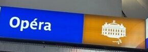
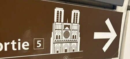
A little detail I noticed in the past few days was how for some famous sites and tourist attractions around the city (Notre Dame, Catacombs, etc.), the signage in the metro will include an icon representing that site. They’re simplified, but with enough detail to be instantly recognizable if you know what you’re looking for. I assumed at first it was just a fun little detail, but remembering the scalloped shells, I began to wonder if there was more to it. Out of all the examples I’ve seen so far, the illustrated signs were to major tourist attractions, the kind that draw in tourists from all over the globe. Literacy rates are far, far better than what they were hundreds of years ago and a good number of languages use Roman letters, either as a central part of their language or as a different script. But at the same time, I can attest to the fact that when in a new place surrounded by a language you don’t necessarily know, it can get overwhelming quickly. I could find and read the words Notre Dame on a sign and know which way to exit the metro station, but my eyes were drawn to the sign far quicker when there was a giant drawing of the cathedral itself on it. It’s a delightful callback, intentional or otherwise, to this clever method of ensuring everyone can find where they’re going just a little bit easier.
Wallace Fountains
I adore the Wallace fountains and want to find more, even if they do all look the same and even if there are 107 of them. It may fall apart, but I currently plan to add a little section to my next blog post each time I find a new one. Currently I have:
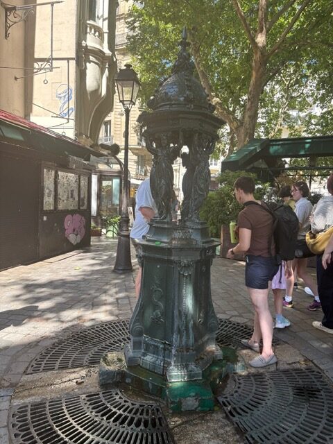
Where Rue Danton and Rue Hautefeuille intersect.
Near the flower market.